Friday, July 06, 2012

Facade Friday!


Image from Treehugger

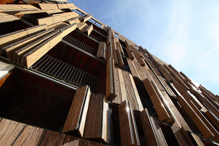
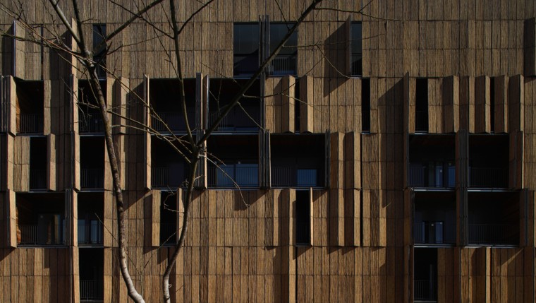
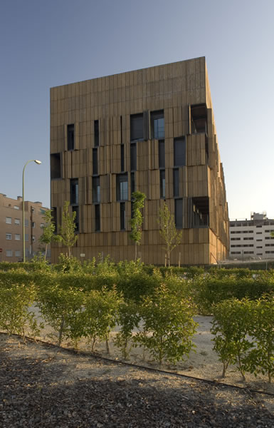
A theme to many of these Facade Friday! posts that I see emerging is that I am drawn to facades that are screen-like in nature. I also am very intrigued by facades that are active and use non-traditional materials and/or traditional materials in a new manner. The facade of the Carabanchel Housing project by Foreign Office Architects (I know, great name!) incorporates all of these qualities.


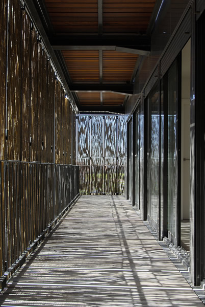
The facade is made up of folding screens made of bamboo. They create privately screened in decks for the units when closed; a view to the outside world when open. The interior effect is really lovely:


The bamboo is a sustainable material, and the screening also helps to keep the building cool. The bamboo screens actually act as louvers, letting breezes through while keeping solar gain out. The participatory aspect of this facade is also great. I love how the proportions of the facade will change daily based on who has their screens open and who has left them closed.


Plus, the screens when opened add an additional layer of texture and chunkiness to the facade. The overall effect is very nice.

Images from NoticiaArquitectura


Friday, June 29, 2012

Forest Fire Friday


A love of buildings and making them has shaped my life and my career, but in the end they are only as good as the people who use them and love them. A place is no good if it contains no love from it's inhabitants.

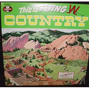
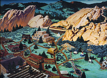
The Flying W Ranch is a place from my youth. Since 1953 they've hosted chuckwagon dinners with the songs of the Flying W Wranglers. On Tuesday, the ranch burned to the ground, a casualty of the Waldo Canyon Fire.

The architecture of the ranch, well, that I can barely remember. But the essense of  the place, and the memory of what was created there, is distinct in my mind. The place was alive with good times and an authentic western atmosphere. I am very sad for this loss, though the family has promised to rebuild.


Images from Amazon.com, The Gazette Telegraph, and The Flying W Ranch Website

Friday, June 22, 2012

Facade Friday!

Rocks!


I've always loved this facade. Such a basic idea, stolen from our friends the engineers over at hill-side management, inc. who use gabions to hold back and stabilize hills.

The neighborhood I grew up in was accessed by a winding road called Crystal Hills Boulevard that was protected by a tall gabion wall - sort of like this:

Image from gabions.net


Except in our case the rocks inside the mesh were the purple/red native rock of Manitou Springs. So the first time I saw the facade of Herzog and De Meuron's Dominus Estate Winery I was immediately drawn to their use of the gabion as a facade/exterior wall. Like my old roadway they used local rocks, uniformly arranged in wire cages.


These exterior gabion walls let filtered light and air through, and they add a cooling effect to the spaces inside. Quite clever. Textural and beautiful too!


Winery mages from The Republic of Less Blog


Friday, June 15, 2012

Facade Friday!

We're back after being camping on the coast last week. And by "we" I mean me and my dog and this here blog.
In honor of my upcoming birthday, I will feature a facade by an architect (and his partner) that shares my special day with me.

Eames House. Image from archpaper.com 

The facade of the Eames house is like a Mondrian painting come to life. What I love is that the patterns and color look so painterly and have such lovely proportions, yet they are also informed by purpose. The black panel with the "x" is a structural braced frame, opaque areas and colored areas obscure views into spaces that need to be more private, or they hide where there is just wall and not space beyond.

I also really like the way the facade slips behind the preserved eucalyptus tree...


All four sides of the house have this similar theme of proportion and function.

Images from Wikimedia Commons
Happy Birthday Charles Eames!

Friday, June 01, 2012

Friday, May 25, 2012

Facade Friday! - Historical Edition

This is one of my all-time favorite facades. Just look at those volutes!


I will buy the first person to identify this building in the comments a beer. Happy Memorial Day!

Friday, May 18, 2012

Facade Friday!

In honor of spring, let's look at facades that are exuberently colorful.

Expansion of the Palais des Congrès de Montréal designed by a collaboration of Tétreault, Parent, Languedoc et Associés with Saïa et Barbarese Architectes, Ædifica, and Hal Ingberg Architect. Image from ArchitectureWeek.com

I love this texture-


This one is actually a brise soleil or "sunscreen". Sounds much fancier to say "brise soleil". Look at what is looks like from the back:

Images from 2modern.com

I love the way the colors reflect against the granite wall. It's a school in Barcelona by Mestura Arquitectos.

This one looks like a watercolor - very lovely:

Image from cubeme.com

It's the Ruban Youth Center by KOZ architects.

And how could I have a blog post about colorful facades without throwing a little Hundertwasser Haus in?

Image from the muslimahsuitcase blog

Happy spring!

Tuesday, May 15, 2012

Brenda Arrives


Image from Capitol Hill Seattle


Alas, Brenda has made her last sweep from the Capitol Hill Station to the Pine Street Stub. We'll miss you rumbling away beneath us, old girl.

Full article here.

Monday, May 14, 2012

This

More "flap?" on the 2012 Pritzker Prize

Friday, May 04, 2012

Facade Friday!

Wow, look at this one:


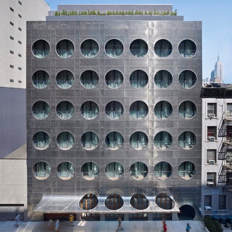
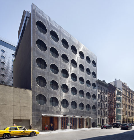
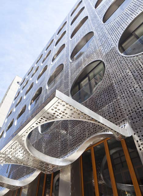
It's the Dream Hotel in NYC by Handel Architects. What everyone is saying (and what is true!) is that it
looks like a giant Connect 4 game.

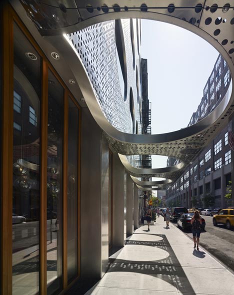
I do like the way the openings wrap down to the horizontal plane over the entry:


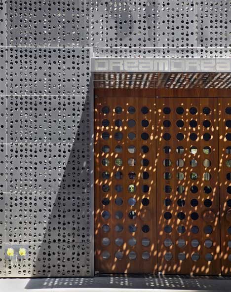
Basically, it seems that the entire parti of this building is: "Perforated!"


It's a bit of a one liner, and I think it's ok as a unique element. But we have to be careful - there really can be only one building like this on a block, or even in a district. A building that is so out of context and scale with it's neighbors starts to exist in a vacuum - so long as the buildings around it "play by the rules" this one can get away with breaking them - I guess? One big plus for this project in my book is that it's an adaptive re-use. So kudos for that!

Building mages from Dezeen.

Monday, April 30, 2012

Wang Shu - Update

Photo from archpaper.com

Wang Shu has stated that his wife and design collaborator Lu Wenyu should have been named along with him and shared in his recent Pritzker Prize.
Read about it here.
This is very interesting. And it is entirely a result of the system of "starchitecture" and the celebration of individualism in our profession. I blame Hoard Roarke. I should blame Ayn Rand! No matter who you blame, behind every single-named firm - if they are doing work of any scale other than single family -lies a team of collaborators who are also responsible for the work. But we'd rather give the big award to the individual. Especially if that individual is a man. Le sigh.

Friday, April 27, 2012

Facade Friday!

Here are some facades that give back, as they incorporate photo voltaic panels to generate solar energy. PV technology has come a long way and so has the aesthetic. Sadly, the price to do this (first costs) is still high enough that it's hard to get something like this incorporated into a project.

Manchester College or Arts and Technology, image from Design-Build Solar


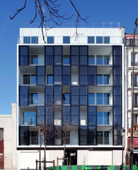
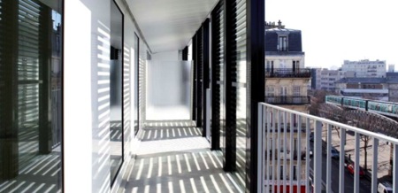
Here, the panels act as functional screens to add shade and privacy to residential porches:

Paris Social housing by Pilippon-Kalt Architects, image from igreenspot.com

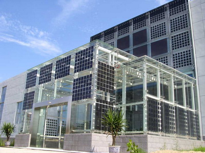
And here they act as windows - a nice feature of many of these panels is that they are transparent so light can be let in.

Images from Solar-constructions.com

And architect Simone Giostra has figured out how to project images from them. 

Very Cool. Image from 3rings.com

What I like about all of these examples is how the panels are used for multiple purposes. They harness energy, act as windows/screens/signage, and add interest and texture to their respective facades. 

Friday, April 20, 2012

Facade Friday!

In honor of my post yesterday, and of Earth Day - I am highlighting a facade that is from an adaptive reuse project.


It's the Scots Church in Sydney, re-christened (excuse the pun) as "Portico". The project included saving the original neo-gothic church including the assembly space on the interior. Then, after some structural gymnastics, they added an entirely new development of apartments on top.
The resulting facades are fantastic. The architects managed to find a way to extend some of the neo-gothic porportions up into the new residentail facades without mimicking them; instead they make for a new layered expression. And anyone who has followed Facade Fridays will know that I do admire a layered facade.


Images from Detail 360 and Architecture Media

The architects are Tonkin Zulaikha Greer, and the project is a great example of saving a fantastic historical/significant structure and making a compelling new building in the process. 


Thursday, April 19, 2012

I love architecture

Image from jeffkreeftmeijer.com

I just heard of this campaign (I love architecture) even though it started back in February. It's kind of great, if you are an architect - it taps into one of the reasons I started really posting again to this blog - it's trying to get us architects to re-engage with the good about our profession. The stuff that keeps us putting up with all of the other crap that we already have heard about that is awful about our chosen profession (for some of that, see here,  here, and here...).

One of the things that I do believe, and it's touched on in many of those doom and gloom articles, is that the profession of architecture is going to have to move out of the old, patriarchal modes of operating, one way or another. We can embrace the change now, or we can be forced very painfully to adjust and re-emerge later. (I actually think that the later is sadly the only way it's going to happen - just look at how the AIA spent the last 3 years and you will be reminded of the old re-arranging the deck chairs on the titanic story).

In the spirit of Glamour Magazine, I've done a little list of what I think should be OUT and what should be IN our profession as we remake ourselves:

OUT
Big egos
Starchitecture
Fetishism of architecture (hello Dwell, even after all of your "green"washing" you are still one of the biggest offenders)
Giving away free work to win the job (and creating a cycle of abuse, we do it to ourselves people)
Howard Roark
Culture of dues paying and abuse of interns
Accepting less because you "do it for the passion" (see also first item above)
Can the word "green" just be out? Like, forever?
Architecture for the 1%

IN
Collaboration
Client appreciation (I know, sexy, right?)
Recognition of work for reasons other than the final pretty picture
Fetishism of good design practices including REUSE, and ECONOMY
Adaptive Reuse
The Rural Studio
Getting paid for our services AND doing it for the passion
Architecture for the 99%
What would you want in?

I guess I'd better go order a T-shirt...before all those people who aren't actually architects "but always wanted to be" snatch them all up after seeing an ad for them in Dwell. Sigh.




Friday, April 13, 2012

Facade Friday!

Today let's look at facades that really say something. I like supergraphics, and done well they can be really great.
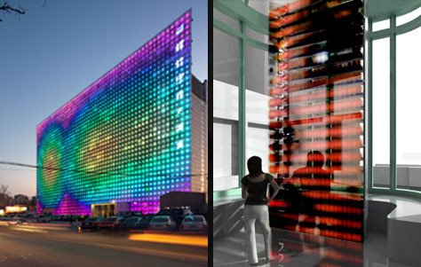
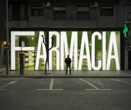
They help you understand the building's purpose:

Image from typeverything.com


They add a layered effect and interest to an otherwise regular or ordinary modern grid of fenestration:

Image from new.pentagram.com

Image courtesy of Hewitt Architects, Sternstein Photography 
(hey, I worked on this one!)

They might "hide" something less interesting beyond, and tell you where you are:


And sometimes they're just a great device to create interest and add an almost ornamental design element:


images from norococo.blogspot.com